Off
View Post
10 Popular Trends in Modern Web Design Elements

10 Popular Trends in Modern Web Design Elements

Trends in web design can change and fade almost as quickly as they become fashionable. But so far in 2013, a handful of trends have really seemed to take web design by storm, and seem to be sticking.

Today, we’re going to examine ten trends in modern web elements and showcase some great examples of each — everything from vintage typography and circles, to vibrant colours and handy vCards. Even better for you is that all of the examples below are available for download (some free, some paid).

1. Vintage Typography

2. Realistic Effects

3. Vibrant Color

4. Ribbons

5. Flat Icons

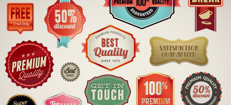
6. Vintage Logos or Badges

7. Cards

8. Circles

9. Simple Gradients

10. Sliders

For the full article, go to: http://designshack.net/articles/inspiration/10-popular-trends-in-modern-web-design-elements/

Off
View Post
How to Create Websites Without Learning to Code

How to Create Websites Without Learning to Code

In May, Scroll Kit, a New York-based startup that lets users create websites without learning a single line of code, attempted to showcase its skills by recreating The New York TimesSnow Fall, an interactive multimedia report.

Scroll Kit recreated the experience, and said it took only an hour to make. However, The Times eventually asked co-founders Cody Brown and Kate Ray to take down the replica, citing copyright violations.

“We thought it was something [The New York Times] would see as an homage,” Brown explained.

After The New York Times also requested that Brown and Ray remove any mention to Snow Fall from their website, Brown refused, saying their statement on the site reflected a true fact. Despite the legal confrontations, Brown said the incident helped gain a lot of interest and buzz for Scroll Kit.

“The responses were pretty amazing,” he said. “A lot of people wanted to learn about Scroll Kit.”

The startup, which was introduced in 2012 at the New York Tech Meetup, ultimately aims to make the web more accessible. Brown, who has a background in filmmaking, said he and Ray “wanted to enable a new kind of workflow for creating webpages” and facilitate the creative process for those looking to express themselves online.

scrollkit screenshot

Image courtesy of Scroll Kit

“Lots of people are very visually creative,” Brown said, citing Scroll Kit as a solution for many who may have been deterred in the past by their lack of HTML or CSS knowledge.

“The major difference [between Scroll Kit and other web hosts] is that you can start a page or an idea without necessarily knowing where you’re going to end up,” he added.

Scroll Kit allows you to insert images and videos, animate elements on the page, add shapes, change colors, insert links and more. Elements can be moved around, altered or deleted with the click of a mouse. The finished code can then be exported and plugged into hosts such as WordPress.

This freedom of creation is an important aspect of Scroll Kit, Brown said. “You can include so much interactive media, which makes [Scroll Kit] a powerful way to tell a story on the web.”

Ultimately, Brown hopes that the startup’s expansion will make online storytelling easier.

“In normal cases, publishing content on the web for many people feels like filling out forms,” he said, referring to the seemingly formulaic nature of coding. “We want to have more people create more handcrafted stories.”

Currently, Scroll Kit is completely free for personal use, while publishers can access special features for a fee. Voice of San Diego and Public Radio International are among those who have used Scroll Kit for projects.

Source: http://mashable.com/2013/06/26/create-websites-without-code-scroll-kit/

Off
View Post
8 Things Every WordPress Developer Should Know

8 Things Every WordPress Developer Should Know

WordPress is certainly a great tool, and it’s quite easy to get started. You can count on a lot of good resources (like this humble blog) and you can even dig into WP’s source code if you know PHP quite well.

But also, it’s quite easy to get lost. There are a lot of options, a lot of solutions, and sometimes it’s way harder to find the best solution than just fixing an issue. Well, let’s see some basic tips and snippets to help you solve some everyday issues.

8 Things Every WordPress Developer Should Know

1. You really shouldn’t use query_posts()

The truth is, among many reasons, you shouldn’t ever use query_posts. This is the most simplistic version of the loop, but as jQuery code, it’ll run a lot of background operations that will mostly rely on the WP_Query (then get_posts) and will require you a lot of code to clean up the mess.

In short, WordPress will load the main query BEFORE calling template files, so if you call a query_post() in your index.php file you’re actually calling 2 queries since the first one was already called. And if you consider the background queries it’s actually 8 (since each WP_Query loads 4 queries, call posts, count posts, call metadata, call terms).

What you should do:

  • Use WP_Query object whenever you need multiple loops in a page. So, sidebar loops, secondary loops in a page template and anything like this will be better using this function
  • Use pre_get_posts filter to modify the main loop. If you need to modify in any way the main WordPress loop (pretty much the case that you would use query_posts) just go for the pre_get_posts filter since it modifies directly the main WP_Query object (instead of getting a new DB query)
  • Use get_posts() if you don’t need a loop. If you are just getting posts and don’t need the main loop functions you could use this one since it’ll return you a simple array of posts

2. Always enqueue your scripts & styles

When you are creating themes, plugins or customizing any of these you may need to load external files. But each WordPress can contain a lot of things, and if you call a JS library twice you can potentially break the site.

The simple solution is introduced with the wp_enqueue_script function, since you can load (and register) a library or script and make sure that you are loading only one copy of it. The same rule applies for styles, but they won’t cause too much damage. Still a good option for loading standard styles, like styling for jQuery plugins, or CSS for HTML bootstraps.

3. Cache your stuff

8 Things Every WordPress Developer Should KnowImage from Kevin Andersson

If you are a plugin developer you should know the transients API. They allow you to store “options” for a small amount of time. So, if you are getting latest tweets, for instance, there’s no point in loading them all the time, you can set a transient for it and only load every 15 minutes or so.

The great thing about it is that you can cache your entire query on it. So if your blog is updated once a day you can set a transient that expires every 12h or less and you’ll be fine.

4. Know all your feeds

It’s always good to provide your usual feeds to your users, but sometimes we need a little bit more. Actually there are quite a lot of cool feeds that you can use:

  • Main – site.com/feed
  • Main comments – site.com/comments/feed
  • Post comments – site.com/post-name/feed
  • Categories & tags – site.com/category/categoryname/feed or site.com/tag/tagname/feed
  • You can also include / exclude categories like this – site.com/?cat=42,25,17&feed=rss2 or this site.com/?cat=-123&feed=rss2
  • Author – site.com/author/authorname/feed/
  • Search – site.com/?s=searchterm&feed=rss2
  • Custom Post Type – site.com/feed/?post_type=yourposttype
  • Custom Taxonomy – site.com/feed/?post_type=custom_post_type_name&taxonomy_name=taxonomy

5. How to add featured image in your feed

8 Things Every WordPress Developer Should KnowImage from Dash

This one is quite simple but gives a good final result (especially if your users are running a nice RSS reader like feedly that displays the main images). This code will do it (in your functions file):


function featured_image_in_feed( $content ) {

    global $post;

    if( is_feed() ) {

        if ( has_post_thumbnail( $post->ID ) ){

            $output = get_the_post_thumbnail( $post->ID, 'medium', array( 'style' => 'float:right; margin:0 0 10px 10px;' ) );

            $content = $output . $content;

        }

    }

    return $content;

}

add_filter( 'the_content', 'featured_image_in_feed' );

Source: WordPress: Add featured image to RSS feed/

6. Optimize your DB once a while

You can use either a plugin or manually but it’s always good to optimize your MySql tables often (at least once or twice a month) so you’ll ensure that your queries are as good as they can be, and will reduce your DB size

7. Enable GZIP

Imagine how great would it be if you could compress your site files before sending them to the user? Well, with server-side GZIP you can do that. And it’s fairly simple, you can add this snippet to your .htaccess file and you’re good to go:


#Gzip

<ifmodule mod_deflate.c>

AddOutputFilterByType DEFLATE text/text text/html text/plain text/xml text/css application/x-javascript application/javascript text/javascript

</ifmodule>

#End Gzip

Source: Enabling Gzip in .Htaccess

8. There’s a plugin for that

Even if you are not a developer you could improve your site performance with caching plugins, DB optimization plugins, CSS and JS minifying plugins.

Source: http://webdesignledger.com/tips/8-things-every-wordpress-developer-should-know

Off
View Post
7 Tips & Tricks To Creating A Gorgeous Restaurant Website

7 Tips & Tricks To Creating A Gorgeous Restaurant Website

In order to create a proper website for people, you should start think in the same way they do. When it comes to designing a gorgeous restaurant website, what should you put your mind to? Well, why do people like going to restaurants? For the food, the ambience, to relax and have a good time with friends. Keeping that mind, restaurant websites can be real useful to the dining business.

Guests can have an opportunity to be acquainted with your menu, style, interior and services. Moreover, an online website also means that you can receive orders online as well as reservations for those interested to check out your restaurant. The website is a necessary attribute of any modern business.

So today I’d like to talk about creation of a proper restaurant website design. It seems easy on the surface, but still there are a few tips you totally should follow in order to create a gorgeousrestaurant website that you can be proud of.

Recommended Reading: 9 Ideas for Building Great Websites With Less

1. Target Audience

From the very beginning you have to find out your target audience. If there is a university near your cafe, students will probably be your frequent visitors. If there is a business center not far from your restaurant then expect business-executive types to lunch at your place. Check your surroundings for the type of target audience, their age group and ultimately their preferences.

After the target audience is defined, you can begin website creation. If it is a students’ cafe, a clean and bright design will be the perfect choice. But if you are trying to engage the more serious managers and office workers, go for an elegant or professional style.

CAU Restaurant

Also, you can arrange “happy hours” or some other discounts to attract more customers. Don’t forget to create an extra website page, slider image or pop-up window for a brief description about it. Here you can see an offer in a slider at the website header. The visitors of this website are well-informed, because the offer is on the main page.

Giraffe

2. Keep It Simple

Every good restaurant website should include important and required pages, such as a home page or main page, the menu, the ‘About us’ page, and a Contact form. It’s critically important to create all these pages, because without any of them the website will never be complete. You can also add a review page in order to show your visitors what people say about your restaurant.

Cantilever

Also, try your best to keep it as simple as possible. There is a design principle noted by the U.S. Navy that is called KISS. It means “Keep it simple, stupid”. By this principle, simplicity and a user-friendly design is your main goal. If a user doesn’t find what he or she is looking for in three clicks,it’s byebye for good.

3. Color Sheme

Have you noticed that the color palette of most restaurant sites consists of four main colors: brown, white, red and black. Of course, these days you can see a full spectrum of colors on restaurant websites, but these main four colors were selected for a reason.

Brown color symbolizes reliability, stability, and adherence to tradition.

FIG

White gives a feeling of freshness, purity, and freedom.

Solegiallo

Black is associated with mystery and power of creation. Moreover, food photography looks great on a black background.

Daimu

The color red is most often used by fast food restaurants as it is the symbol of passion and secret desires. Always try to take into consideration the fact that colors influence a user’s behaviour. Use this knowledge to your benefit.

Backyard Burgers

4. Easy-To-Use Contact Form

Your restaurant website should have an easy-to-use contact or feedback form. It’s not enough just to leave an email address or a phone number on the contact page. A contact form lets you add fields which can help narrow down what the person is trying to contact you for.

Also, don’t forget to attach a map to the form in order to show the location of your restaurant, that will remove questions about the location of your restaurant.

Cannolificio Mongibello

5. Stay Sociable

There are lots of social websites you can use to share information and find potential customers. Let your visitors follow your news, updates, and even staff via social networks. Stay open to communication, be friendly with your customers, be kind and they will act in the same way.

The Noodle Box

Word of mouth” is a quite strong motivator. You can turn it to your advantage. Just share information that is really useful and interesting to your target audience, for example, the rules of proper nutrition with the corresponding dishes from your menu.

6. High-Quality Images

On the Web we are constantly fighting for attention and the website is usually on the front-end trying to get people to click in and find out more. Hence, it needs to be attractive first of all. Large background photos are an amazing choice for restaurant website design.

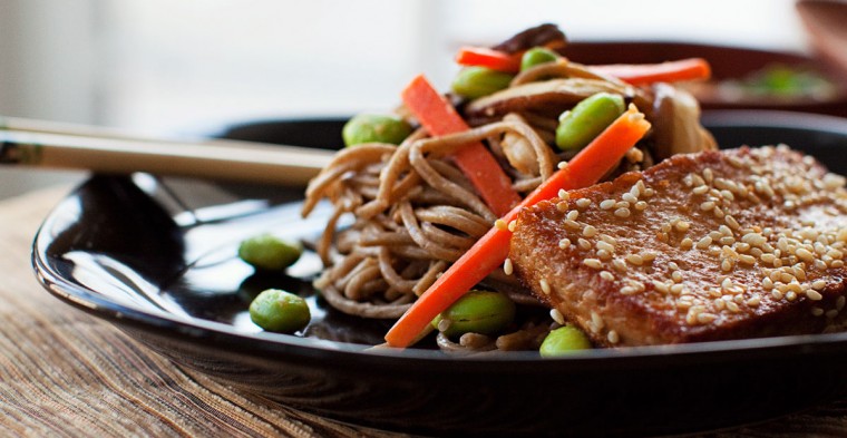
Also, you can add some high-quality images to the menu page in order to demonstrate how your dishes look like. Make the images “delicious”, they are supposed to arouse an appetite. Food photography should awaken a desire to try them out, because when they do, people can’t wait to step into your restaurant and get a bite.

Easy Bistro

Moreover, you can add some interior photos to your site to convey the cozy atmosphere that prevails in your restaurant.

7. Killing “About Us” Page

Your website is an instrument to win over the crowd and to top your competitors. The “About us” page should be unique and make you stand out from the crowd. Try to find your personality layer and add it there. Show your potential customers how friendly and professional your team is.

Square

People read the web information differently from the way they read books and magazines. They read fluently, selecting the key points for themselves. Keep this fact in mind and highlight the main moment with bold font. It will help not just to perceive the information better, but also to index it for search engines, such as Google.

Bonus Tip: Logo Placement

I’d like to share one more small tip with you. Almost all websites try to place the logo on the top left corner of the page. But why?

Napoli Centrale

According to the scientific research, when a person opens a website, his or her view runs from left to right. People are used to reading in a such way. So, the best place on the page to put a logo is the top left corner.

Conclusion

These tips are designed for beginners, but I hope that the pros appreciate them as well. Define your goals and try to achieve them with the help of your website. Remember that perfection is a journey, not a destination.

Source: http://www.hongkiat.com/blog/designing-restaurant-websites/

Off

Migrating A Website To WordPress Is Easier Than You Think

Now powering over 17% of the Web, WordPress is increasingly becoming the content management system (CMS) of choice for the average user. But what about websites built with an outdated CMS or without a CMS at all? Does moving to WordPress mean starting over and losing all the time, energy and money put into the current website? Nope!

Migrating a website (including the design) over to WordPress is actually easier than you might think. In this guide, we’ll outline the migration process and work through the steps with a sample project. We’ll also cover some of the challenges you might encounter and review the solutions.

About This Guide

Before we get to work, let’s establish some context. First, this guide was written primarily with beginners in mind and will be most helpful for basic websites. Some of you will likely encounter advanced aspects of WordPress migration, but they are beyond the scope of this guide. If you’re tackling an advanced migration and get stuck, feel free to share your difficulty in the comments below.

OBJECTIVES

The objective of this guide is to help you with the following:

  • Plan an effective migration to WordPress.
  • Walk through the technical steps involved in migrating.
  • Get ideas and resources to solve common migration challenges.

ASSUMPTIONS

I assume you have basic familiarity with WordPress. Previous development experience with WordPress would be helpful, but not necessary. I also assume you have an existing website and design that you want to migrate to WordPress.

BASIC STEPS

Here are the basic steps that I recommend you follow for a typical WordPress migration:

  1. Evaluate website.
    Work carefully through the pages on your existing website, identifying all of the types of content (standard pages, photo galleries, resource pages, etc.) and noting any areas that need special attention.
  2. Set up environment.
    Set up WordPress and get ready to import.
  3. Import content.
    Bring over and organize your content, whether via an importing tool, manual entry (for a small amount, when no tool is available) or a custom importing process.
  4. Migrate design.
    Incorporate your existing design into a custom WordPress theme.
  5. Review website, go live.
    Carefully review the import, making adjustments where needed, set up any URL redirects, and then go live.

With this outline in mind, let’s work through each step in detail.

For more check the orignal article on Smashing Magazine: http://wp.smashingmagazine.com/2013/05/15/migrate-existing-website-to-wordpress/