Off
View Post
Beautiful and Simple Logos for your Delight

Beautiful and Simple Logos for your Delight

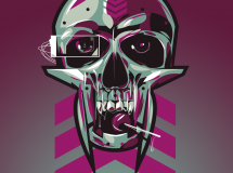
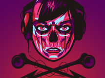
As you know, we love logos, especially the ones that get our attention for their beauty, simplicity or intelligence. Logos are a nice way to get inspired, especially if we think about how much a designer has to communicate in such a limited graphic. It is certainly a tough job to create the face of a company, and this is why today we will show you some simple, beautiful and effective logos that will get you inspired for your own projects. Take a look and remember to click on the images to know more about each logo and its designer.

Beautiful and Simple Logos for your Delight

Beautiful and Simple Logos for your Delight

Beautiful and Simple Logos for your Delight

Beautiful and Simple Logos for your Delight

Beautiful and Simple Logos for your Delight

Beautiful and Simple Logos for your Delight

Beautiful and Simple Logos for your Delight

Beautiful and Simple Logos for your Delight

Beautiful and Simple Logos for your Delight

Beautiful and Simple Logos for your Delight

Beautiful and Simple Logos for your Delight

Beautiful and Simple Logos for your Delight

Beautiful and Simple Logos for your Delight

Beautiful and Simple Logos for your Delight

Beautiful and Simple Logos for your Delight

Beautiful and Simple Logos for your Delight

Beautiful and Simple Logos for your Delight

Beautiful and Simple Logos for your Delight

Beautiful and Simple Logos for your Delight

Beautiful and Simple Logos for your Delight

Beautiful and Simple Logos for your Delight

Beautiful and Simple Logos for your Delight

Beautiful and Simple Logos for your Delight

Beautiful and Simple Logos for your Delight

Beautiful and Simple Logos for your Delight

Beautiful and Simple Logos for your Delight

Beautiful and Simple Logos for your Delight

Beautiful and Simple Logos for your Delight

Beautiful and Simple Logos for your Delight

Beautiful and Simple Logos for your Delight


Source: http://webdesignledger.com/inspiration/beautiful-and-simple-logos-for-your-delight

Off
View Post
New Logo and Name for Ernst & Young

New Logo and Name for Ernst & Young

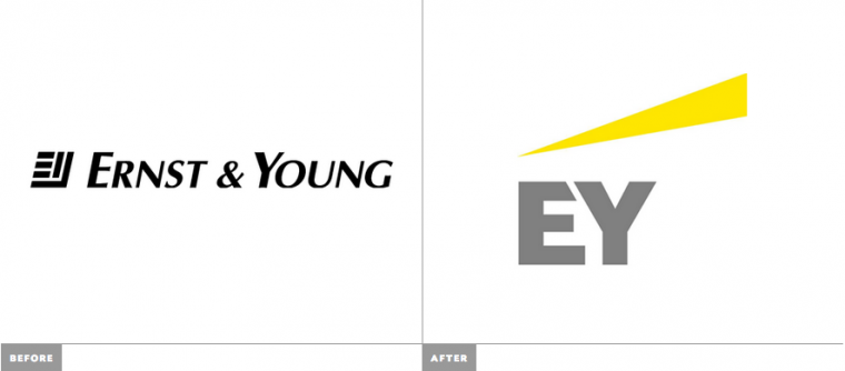
Established in 1989 with the merger of Ernst & Whinney (previously Ernst & Ernst, est. 1903) and Arthur Young (est. 1906), Ernst & Young is one of the leading global providers of assurance, tax, transactions, and advisory services and are among the elite “Big Four” who handle the majority of audits for publicly traded companies. Over 167,000 employees work at its 700-plus offices in more than 140 countries. This week Ernst & Young introduced various changes: a new Global Chairman and CEO, a change of public name to EY, a new logo, and a new purpose, “ Building a better working world”. No design credit given.

Update: Identity was designed by London-based BrandPie

New Logo and Name for Ernst & Young by BrandPie

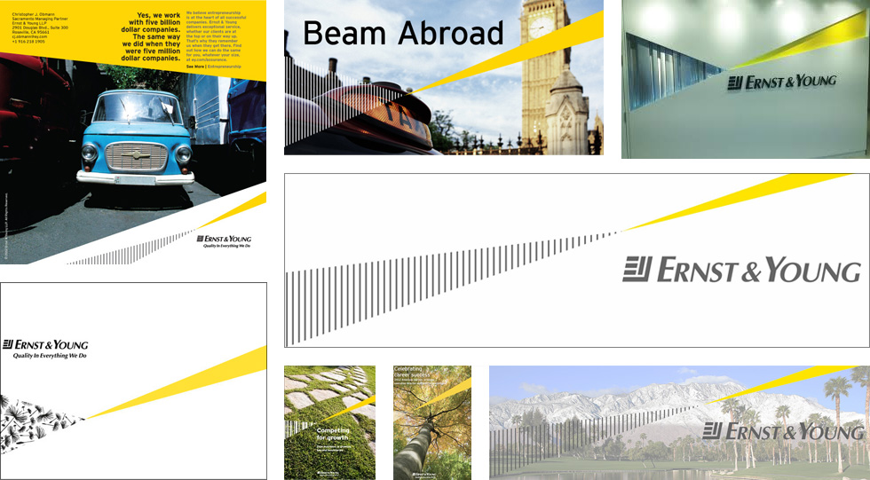
A sampling of old materials found online that already used the “Beam” and Interstate type family.

From 1 July we will be called EY. Shortening our name will provide consistency and ease of use for EY practices and clients around the world. We have also redesigned our logo, reflecting our new brand name clearly in the design. Our new brand name and logo demonstrate clearly and boldly who we are and reflect the goal we have recently set ourselves to be the number one brand in our profession.

press release

New Logo and Name for Ernst & Young by BrandPie

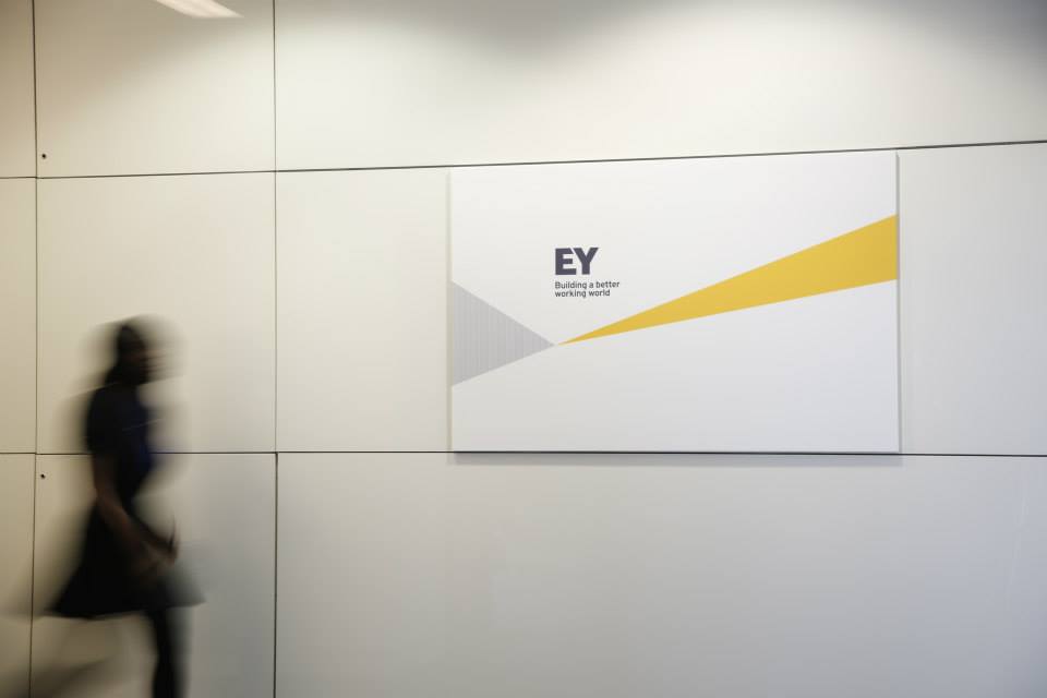
Logo detail.

We know that building a better working world is an ambitious objective but it is an incredibly important aspiration and will be front and center of everything we do as an organization.

press release

New CEO Mark Weinberger introduces concept of “Building a better working world”. Mostly boring and no additional visuals other than a lukewarm animation of the new logo.

You know… I had never really paid attention to the old Ernst & Young logo. From memory I would have remembered it had a tilted, square icon of some sort but I hadn’t realized it was a minimal, interlocked “E” and “Y”. So very nice. The accompanying type wasn’t too terrible and it clearly stated the company’s seriousness. The new logo maintains the interlocking “E” and “Y” approach but in the least unimaginative, unexciting, uncontrollably dull way possible. Perhaps they were aiming for sophisticated, bold simplicity but they missed that target by miles. The new logo also makes more clear use of the “Beam” graphic that has already been used by the company for some time (see top image) but it does nothing in favor of the monogram — if anything, it makes the logo look more like a trucking company or the parent company of Budget car rental.

New Logo and Name for Ernst & Young by BrandPie

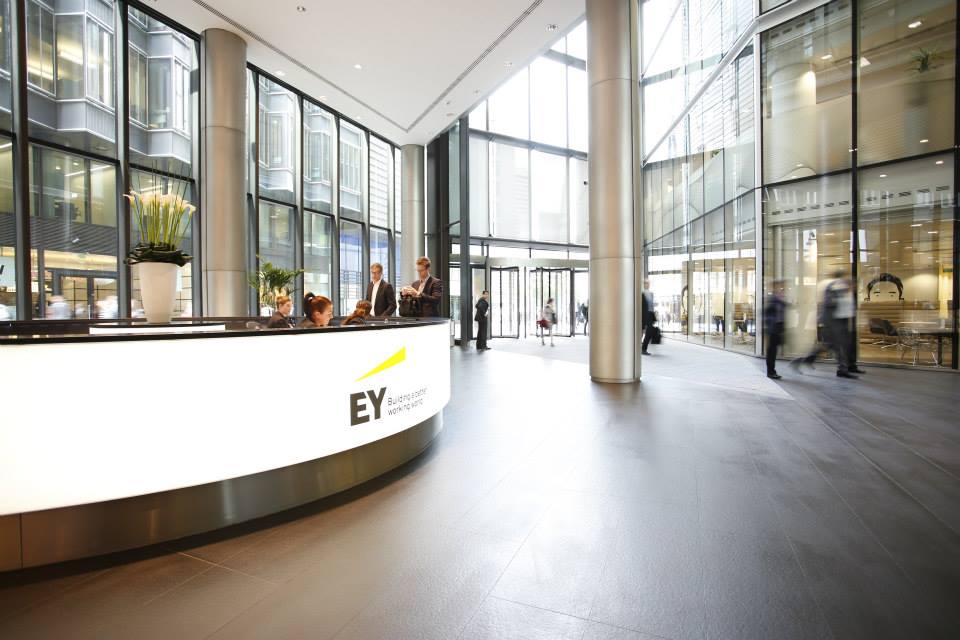
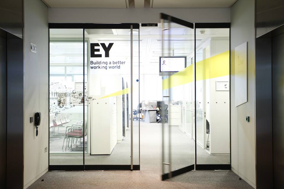
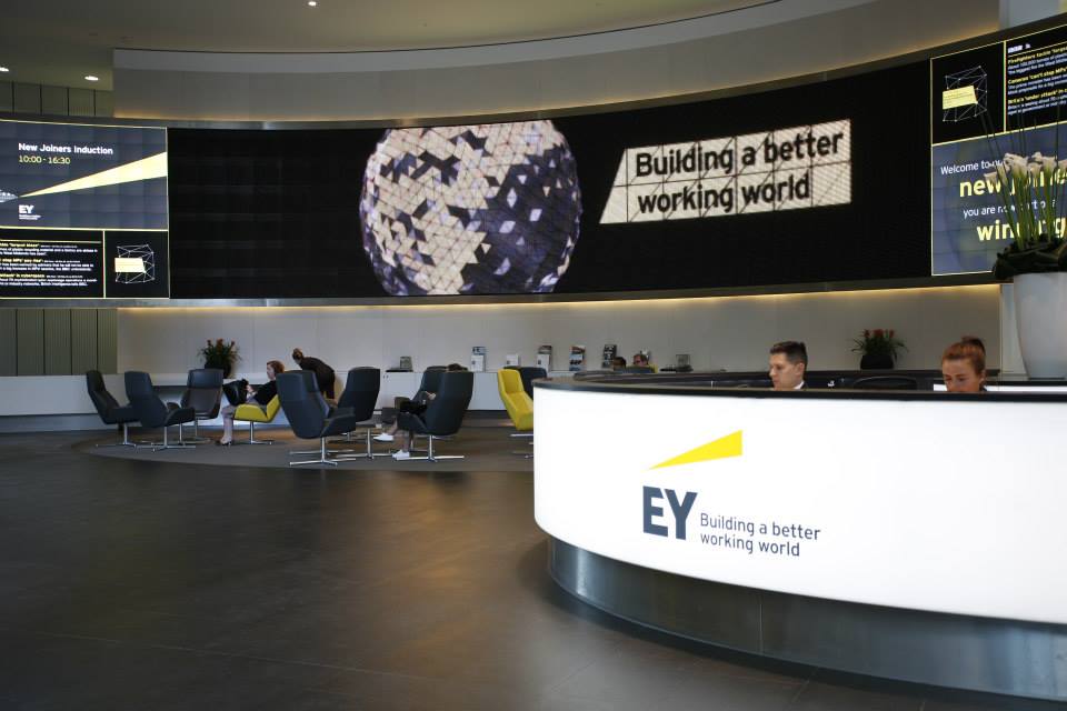
This image and all below taken at EY’s London office. Full set of photos here
New Logo and Name for Ernst & Young by BrandPie


New Logo and Name for Ernst & Young by BrandPie


New Logo and Name for Ernst & Young by BrandPie


New Logo and Name for Ernst & Young by BrandPie

In application, judging from some things that can be gleaned from the photos above, there seems to be some “cool” supporting graphics in the form of illustrations across the window walls and in the video playing on the lobby screens, but there doesn’t seem to be a clear story here. Overall, a boring logo, executed without any flavor that does little in building a better working world.

Source: http://www.underconsideration.com/brandnew/archives/new_logo_and_name_for_ernst_young.php#.Ud4yfT7k-9w

Off
View Post
Logo Design Trends for 2013

Logo Design Trends for 2013

Logos are everywhere, and for those who toil in the mines of design, they are the ideal – a single graphic signature meant to communicate the very essence of a company, product or person. The minds at CreativeBloq.com recently put together 20 of the biggest trends in logo design; here are five of the most interesting.

Black and white. In many ways color is to logos what digital is to design – it’s all just a little too cheap and easy these days. When Pantone continues to find dozens of new colors at a time, there’s something stoic and, well, respectable about some good black-and-white typecraft.

App Store Influence. Such is the ubiquity of smartphone and tablet apps, we’re starting to see that 3D-button look creep into the logos of some companies.

Transparent Overlaps. Shapes are linked together using subtle gradients for a single, unique look, as in this EDP logo.

Honest and Simple. “Homemade and thrifty is very in,” according to CreativeBloq, and who can say otherwise? The more homemade the logo looks, the less contaminated by the excesses of big business a product appears to be.

Incomplete. Missing pieces of a logo actually entice viewers to study it more. Check out the identity for market-research firm Basis, designed by Johnson Banks.

Script retro. If everything old is new again…aw heck, who cares – script is still the epitome of cool when done right, as in this example by BrandOpus for Willie Cacao chocolate.

Article Source: http://www.paperspecs.com/26426/20-logo-design-trends/