Good design is all around us. Not just in printed materials or on websites, but also in everyday items. What’s great is that you often don’t notice it — you just enjoy whatever item, tool or website you are using.
Nowhere is this more true than with mobile apps. Most of us use them every day, but do you ever stop to think how much they are shaping the way you approach design? Apps can be a great source of inspiration and also another reminder of time-tested design concepts. Here are ten of the great lessons I have learned (and re-learned) from iPad apps.
1. Focus on Simplicity

Clean lines and simple user interfaces are common among apps. It is something we are seeing more of in other types of design as well. The branding themes from Apple itself has followed a concept of simplicity for some time, and that has translated well into its products — something app designers seem to have embraced.
Simplicity is also important because of size – too much to look at or choose from on a small screen can be overwhelming. But this also works for the time-strapped user. Keep it simple, easy to use and quick to understand and people will likely embrace your design project.
And while we are talking about basic design principles, remember to make web designs responsive. Nothing is more annoying than an app that does not turn when you rotate the screen. The same is true for a website that does not adjust for browser size.
Examples: Apple iOS, Kindle, Next Issue
2. Not Everything Has to be Square

Have you ever noticed how much of the iPad (and iPhone) interface has rounded edges? If not, go take another look. The simple curvature reminds us as designers that it is OK to not always be perfectly square.
What’s great about the icon shape is that it is quite simple, a bit unexpected and un-dramatic. Effects do not need to shout at a user to be appreciated. They are often most effective when they just fall into the overall design scheme.
3. Sleek Design Matters

Things really do have to look polished. And complete. There are just too many choices out there, and people are not going to spend time with things that look bad or are hard to understand.
A few years ago you might have been able to get away with a hint of sloppiness or a beta release of a site with some issues, but no more. In this no-holds-barred-world, everything is critiqued, criticized and analyzed. Make sure your project is completely finished and functioning properly if it is online. And then make sure it looks amazing — people have come to expect good design.
Examples: Weather HD, Fanhattan
4. Think Big for Calls to Action

Sometimes you have to scream to get your message across. Whether in print or online, calls to action, such as buttons or phone numbers need to carry some weight. Show users where to click online. Don’t make them look for it.
Provide immediate facts such as contact info, pricing or event information in online material so readers don’t give up before understanding what you want. In printed media, also consider a digital component, such as a QR code, to keep people engaged.
Examples: Pimp Your Screen, Skype
5. Engage Users/Readers

The joy of a good app is that you keep going back to it, whether it is a game, a tool or just a daily diversion. Treat your design projects with that in mind – you want people to come back.
But how can you engage them? There are a lot of tricks out there from gamification to contests, but the best way is with a quality product. Think about your projects, what can you do to really make them great and encourage people to come back to them again and again?
Examples: Angry Birds, Nike+
6. Stick to a Minimal Color Scheme


This has always been a goal for designers, but apps really brought it back into focus. Sticking to a minimal color scheme is of utmost importance.
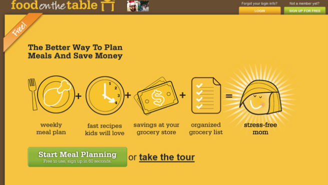
What really strikes me about some of the best apps is the use of a single color and tints to create a really distinct design – Food on the Table is a great example. It creates a perfect sense of what app you are looking at from the minute it opens, which can be great for those who often tap the wrong item.
But other apps work great with just a color or two. The balance is lovely. And there is a lot to be said for keeping things like type simple — black and white never goes out of style.
Examples: Food on the Table, Business Card Designer
7. Flat Design is OK

Apple is often seen at the other end of the spectrum from flat design, but more and more iOS apps are employing a more flat design interface. Forget all the fancy shadows and effects; elements are just displayed on the screen. And it looks good.
This design principle falls very much in line with the theme of simplicity and is a great tool for ways to try something different with design projects.
8. Spacing, No Matter How Small, is Important

In smaller spaces, spacing becomes more and more important. It creates a mood – from open to cramped – and can dictate readability. Moreover space is key to usability when it comes to tapping apps, if you touch too many things, it will not work properly.
Sometimes as designers – especially when dealing with limited spaces in print – we will try to cram too much information in a space. But what we really need to do is work to use that space more efficiently. Design with open, white or negative spaces to create a better feel and make readers more comfortable while processing your information.
Examples: Band of the Day, The TUXedo Builder
9. Clean Navigation Counts

Navigation is paramount in a mobile app — it has to be fast. Apps often use only a few options to direct users – think of a this-or-that model – which can translate well to other types of projects. Too many options can be a bit overwhelming.
So how do you create clean navigation for non-web projects? Use weight to establish a clear hierarchy for the eye. Tell readers where to start, and then how to move through the creative material. Remember that bigger, bolder items will likely be the first things that will cause the eye to stop.
10. Every Visual is Important

You can’t get away with a poor visual in an app – ever. Think about the sharpness of the iPad retina display or the zoomability of any object on the screen. Poor images will ruin an otherwise solid design in a minute.
We’ve all done it – snuck in a poor quality image at some point – but apps have really made me remember how bad of an idea this truly is. Every little pixel will jump off the screen. Every person looking at it will question your commitment to quality.
Poor images are poor images. Stay away from them. It is actually better to forego an image than use a bad one just to fill space.
Examples: Snapguide, Fantastic Dinosaurs, Popsugar
Conclusion
What’s great about apps is they have taught designers (myself included) a whole new appreciation for great design. They’ve also made us much less tolerant of poor design.
The biggest lesson any of us can learn from them is to get back to the basics. Quit decorating and start designing. Think about the principles that make something great and go with it.
Now that we’ve got you thinking, what are some things you have taken away from apps?
Source: http://designshack.net/articles/inspiration/10-things-i-learned-about-design-from-ipad-apps/

